HSBC design system
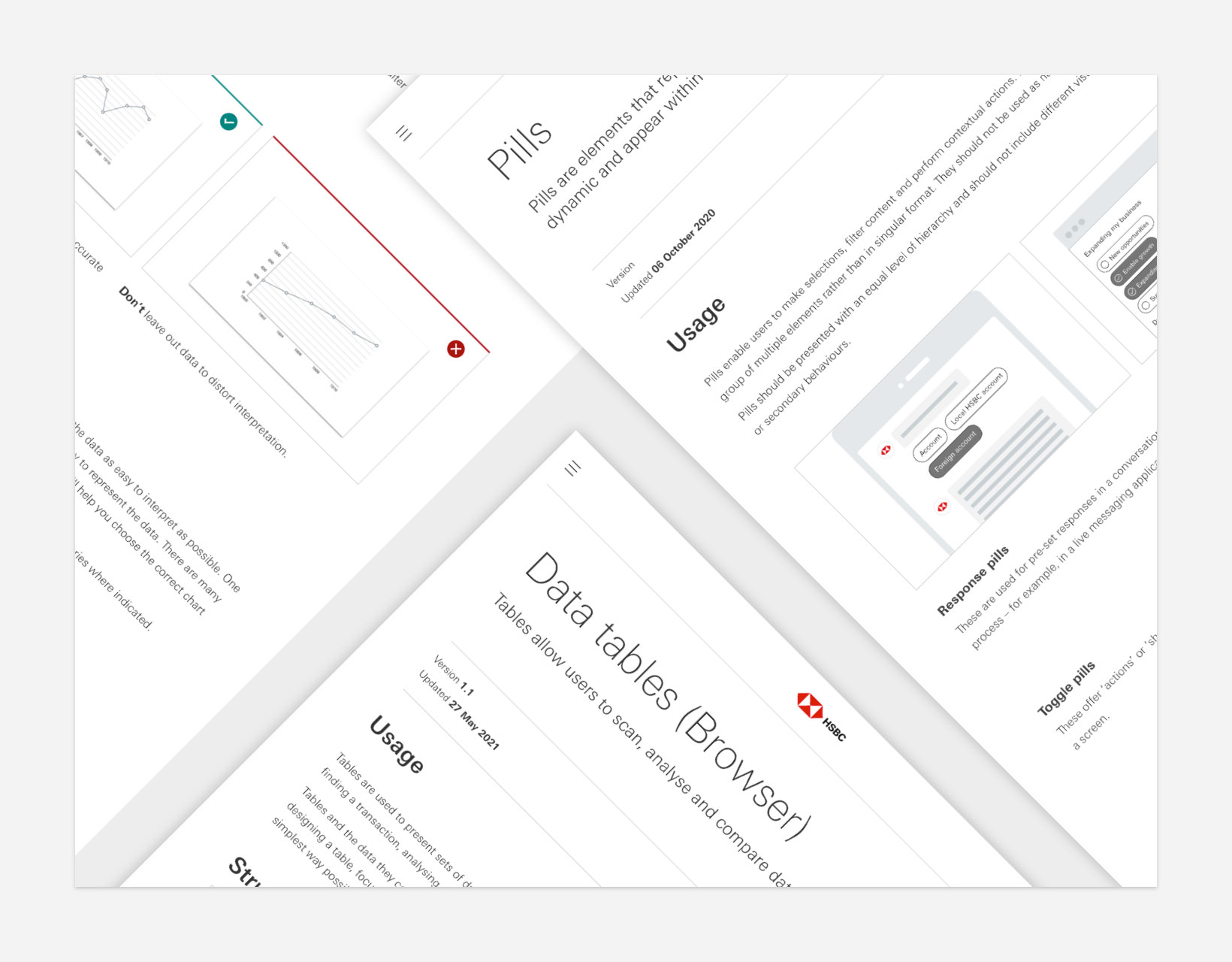
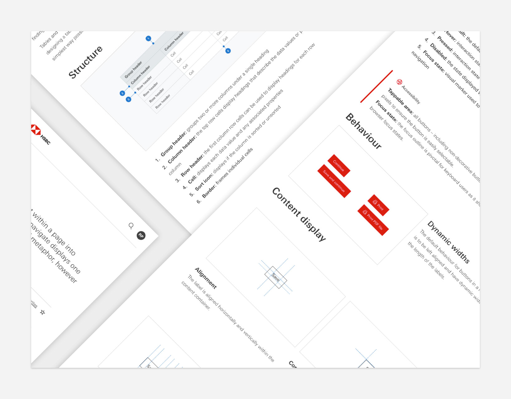
Working with the Digital Design department within HSBC we set about creating new digital guidelines and standards across both the app and responsive platforms for Retail and Corporate banking. This project would grow to provide a complete design system solution published at create.hsbc.com for use across the whole bank in over 30 countries.
–––
Worked with leads from across HSBC in regular weekly reviews to help align and define foundations, page elements, components and patterns within the bank
–––
All components were checked for compliance to AA levels of accessibility
–––
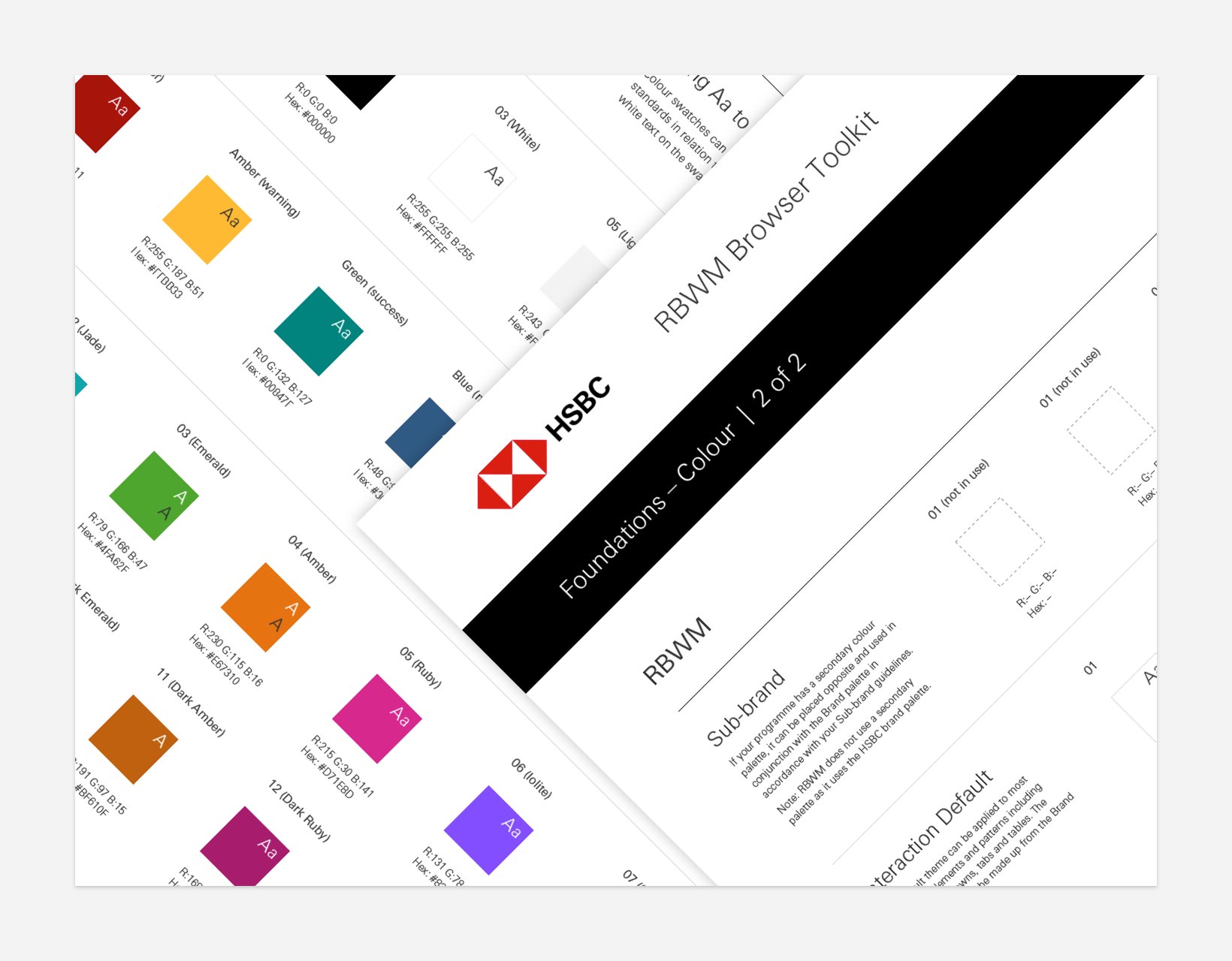
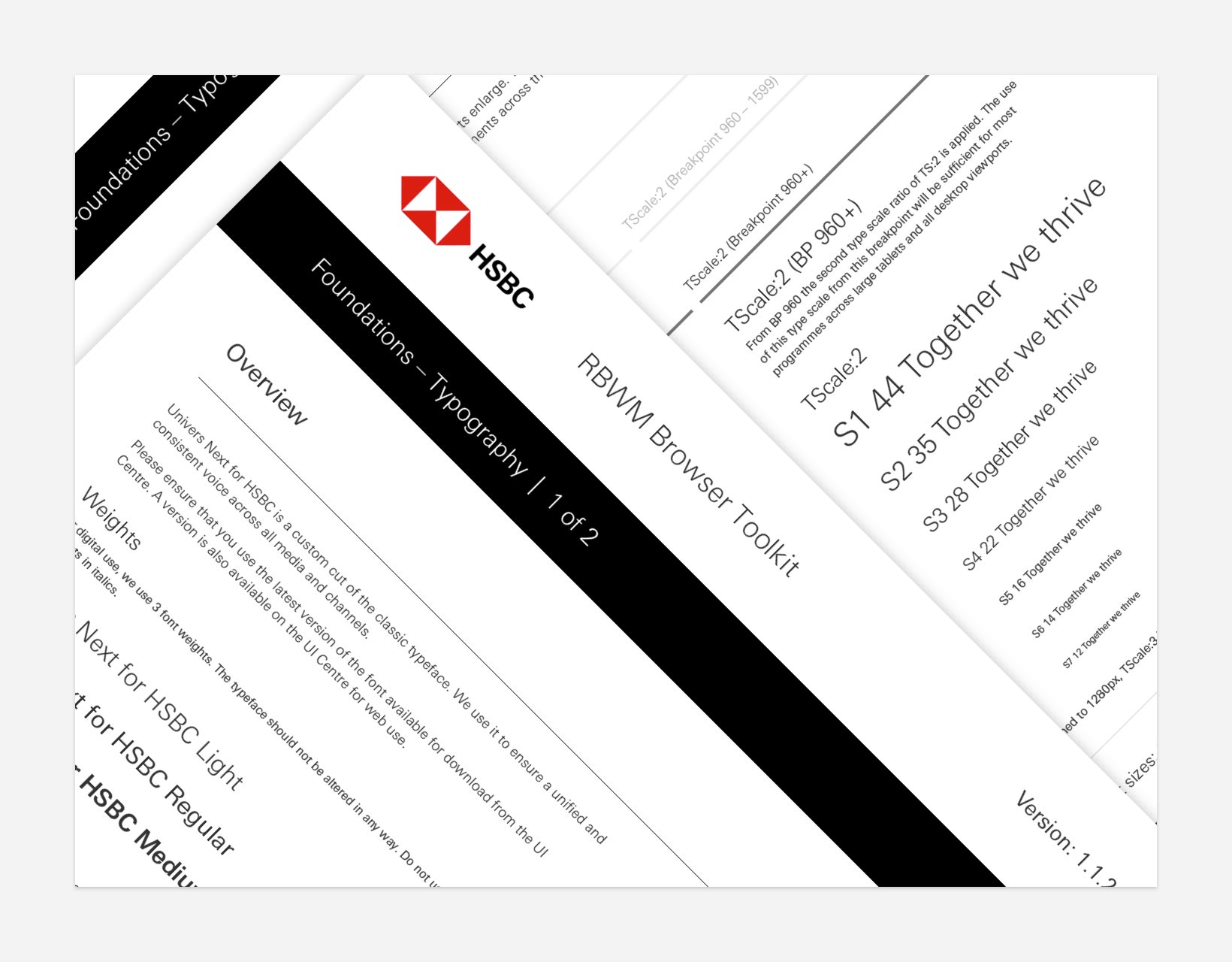
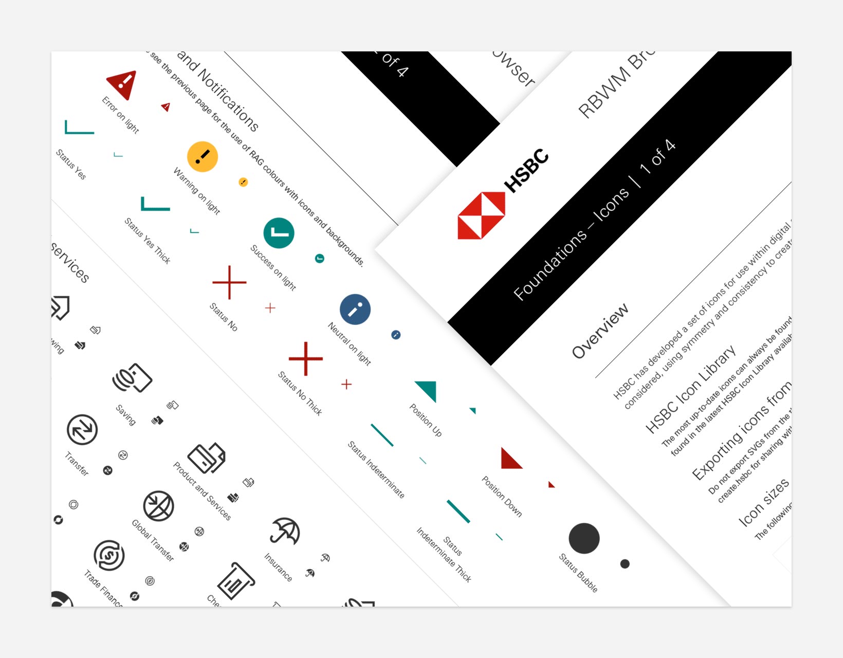
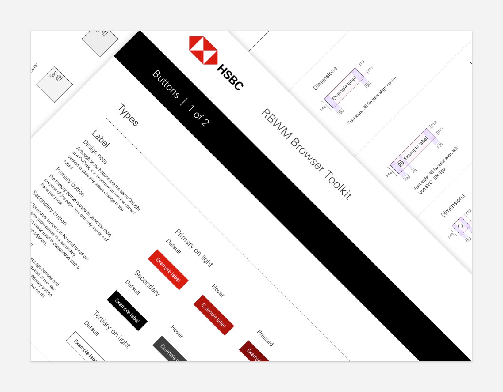
To enable easy adoption we produced atomic based component and styles toolkits and libraries tailored to the different business lines for both app and responsive platforms
–––
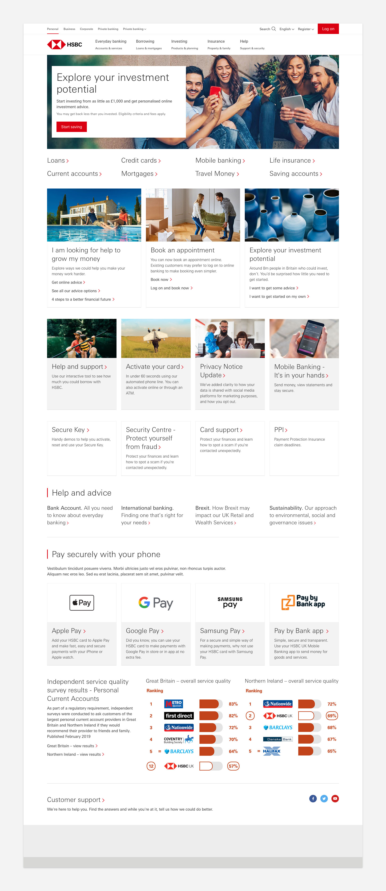
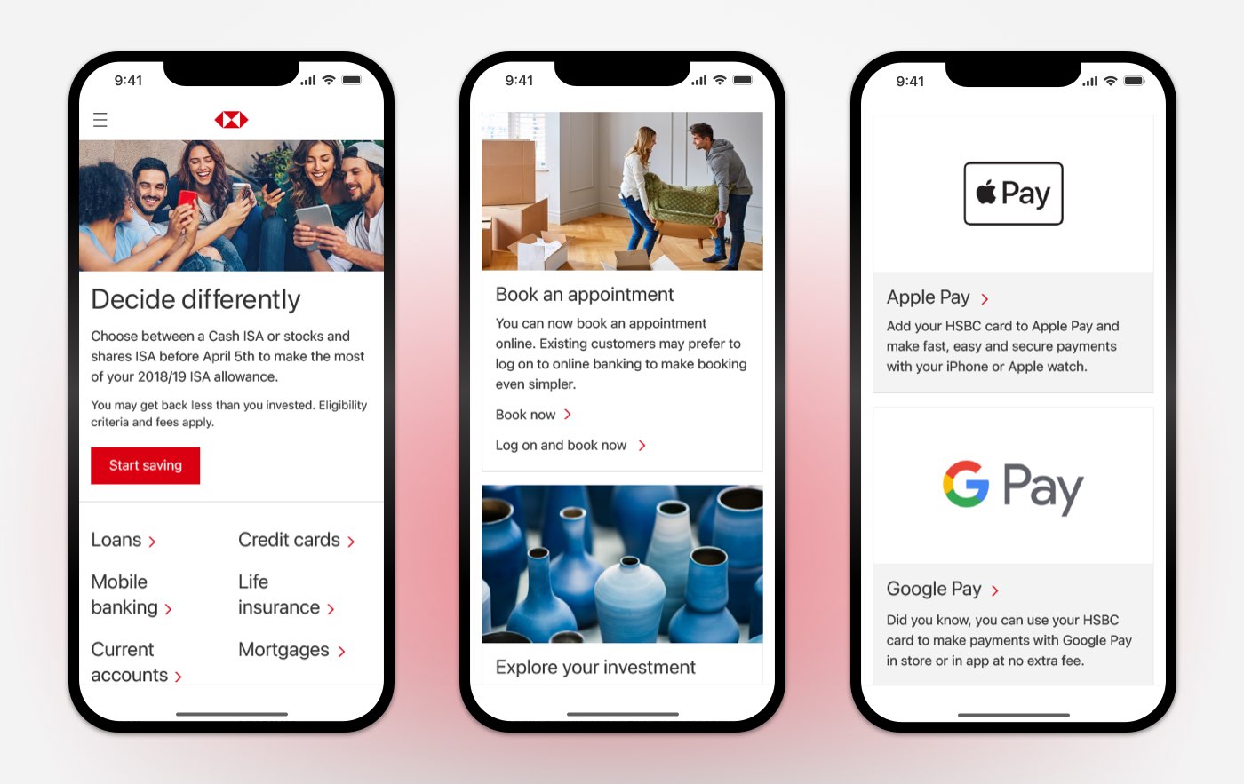
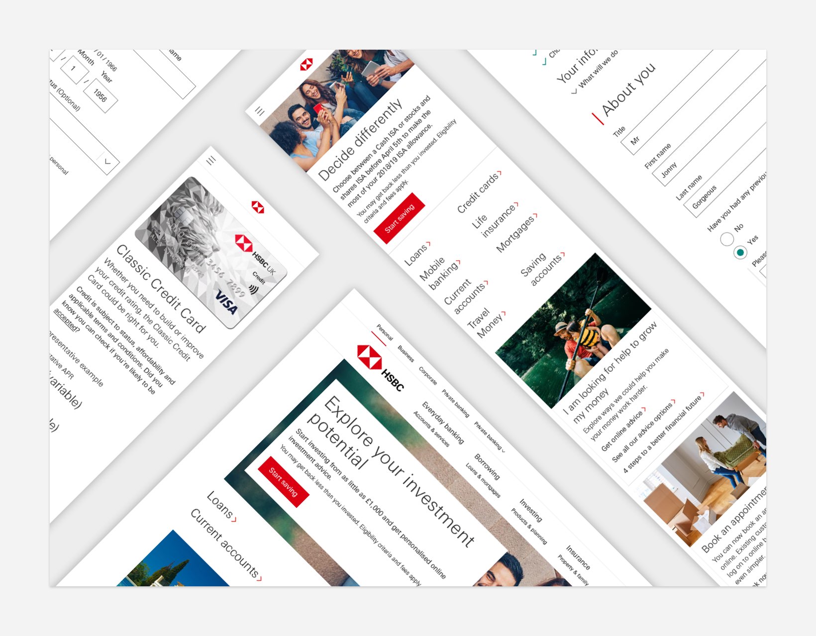
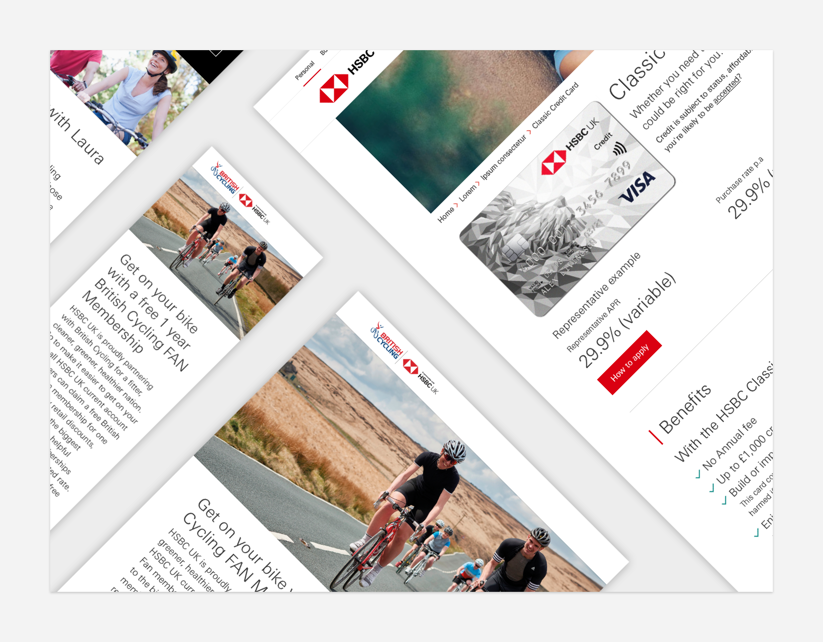
We produced template designs within the toolkits to test the foundations and components and also to make it easier for new starters to hit the ground running
–––
The newly created guidelines and standards together with their component and styles based toolkits were published on the central brand platform
–––
Researched into the transition from Sketch to Figma
–––
Created Figma based design toolkits and implemented design tokens at a foundational and component level
AgencyAnalogFolkClientHSBCServicesDesign systems, design standards, UI/ux design, Figma libraries, design tokens, accessibility
